

Housing Data Project
Final Report
Prepared by Frances Astorian and Allen Lang
Introduction
As Charlottesville continues to develop, it is important to monitor sources of inequality that can emerge from growth. In regards to housing, a problem exists in the mismatch between housing prices and income. Key problems include shortage of housing options close to jobs in Charlottesville’s urban areas, scarcity of affordable housing, and high construction costs. The Department of Housing and Urban Development (HUD) defines housing affordability as not spending more than 30% of the household’s income on all housing-related expenses(1). Under this definition, many families across all income levels cannot find affordable housing. Families earning income that is 50% or less of the area median income (AMI) of $89,600 (in 2018), have a 65-70% chance of paying more than 30% of their income on housing related expenses(2). Families living in cheaper housing farther from the city center instead incur transportation and commuting costs.
The Center for Civic Innovation (formerly Smart Cville) Housing Data Project analyzes how the housing market in Charlottesville has evolved over the past 20 years from 2000 to 2019. It hopes to produce tools that better understand how real estate values have changed and the potential impact that it has had on the local community. By talking to stakeholders, quantifying real estate growth (e.g. sale prices over the past 20 years), and identifying trends in the data (e.g. the areas in Charlottesville where the problem of affordable housing may be particularly prevalent), the project’s analysis can help policymakers, stakeholders, and the general public better understand the problem and facilitate a conversation on how to promote change.
(1) The Central Virginia Regional Housing Partnership. Comprehensive Regional Housing Study and Needs Assessment. Thomas Jefferson Planning District Commission, 2019, tjpdc.org/media/CVRHP-Housing-Needs-Assessment-Packet-web.pdf.
(2) Hays, Emily. Affordable for Whom Charlottesville Tomorrow, www.cvilletomorrow.org/articles/affordable-for-whom/.
City of Charlottesville
From the Charlottesville Open Data repository, the Municipal Boundary Area for the City of Charlottesville is defined and represented in Figure 1.
Over the past 20 years, sale amounts of parcels in Charlottesville have increased. Of the parcels with at least two sales in the past 20 years, almost 80% of them have the last sale greater than the first sale. Additionally, 62% of the parcels have strictly increasing price changes: a sale history in which each subsequent sale was greater than the previous.
Figure 2 shows the average (purple) and median (red) sale price of city properties for each year from 2000 to 2019. While average can be more prone to skewed data, both plots share similar trends. The median sale price per year shows a steady rise in the prices of housing in the city of Charlottesville, with a slight dip near 2007 and 2008 most likely attributed to the Great Recession. The median price in 2000 of $117000 is about a third of the median price in 2019 $331000.
Figure 2. Average and median sale prices of houses in the City of Charlottesville from 2000 to 2019. Source: GitHub Link
Interactive Figure Link
The fact that real estate prices have increased in Charlottesville over the past 20 years is not at all surprising. However, it becomes interesting when it is displayed next to national data. Figure 3 below compares the median (orange) and mean (green) trends in national residential real estate prices to the Charlottesville mean residential real estate sales from 2000-2019. While Charlottesville’s residential real estate prices used to lie below the national average, this trend has reversed in recent years. For the past two years, the Charlottesville sale prices have averaged around $100,000 higher than the national median.
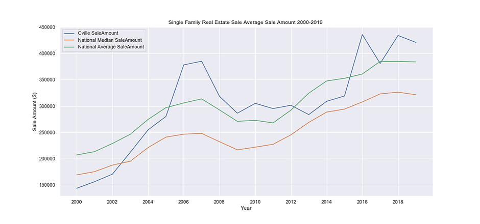
Figure 3. Average and median sale prices when compared to national values.
Source: GitHub Link
Folium’s HeatMap plugin is used to produce a visualization of sale amounts over time in the City. The local extrema maps colors to prices relative to that given year, while the absolute extrema maps colors to prices relative to all 20 years. The former is useful in determining where the most expensive sales have occurred in one year while the latter is useful in determining locations and times in which the largest ever sale occurred. From the absolute extrema map, the most expensive sales occurred in downtown Charlottesville (center of the city) as well as in neighborhoods south of the city center. The local extrema layer shows a similar trend, while also showing that higher sales occurred in the northern area of the City in the early 2000s before shifting south in the mid-to-late 2010s. From both maps, one constant is that higher sales remain clustered around the downtown area of Charlottesville.
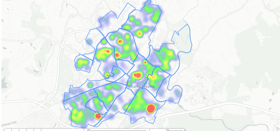
Figure 4. Heat map of parcel sale amounts from 2000 to 2019.
Source: GitHub Link
By Neighborhood
Figure 5. Planning neighborhood areas.
Source: GitHub Link
The Neighborhood Development Services (NDS) has listed a set of boundaries defined as “Planning Neighborhood Areas”, shown in Figure 5. All parcel data is located within these 19 regions, and as a sum represent the Municipal Boundary in FIgure 1. Using a geospatial algorithm to classify each parcel into a specific neighborhood, observations and analysis can be generated off of visualizations that are organized by these regions. Using Folium’s Choropleth plugin, a color scale can be placed onto a map in which the colors are determined by magnitudes of each region. The figure below shows the median sale amount for each region over the past 20 years.
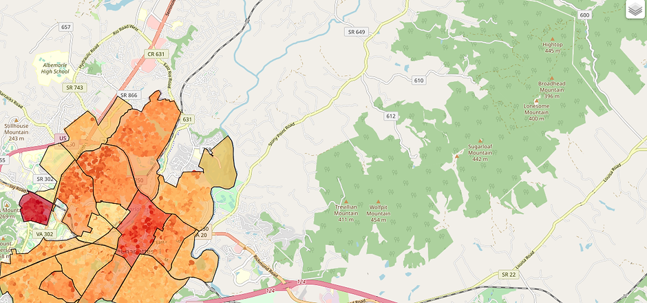
Figure 6. Choropleth of median sale prices per neighborhood region.
Source: GitHub Link
North Downtown has one of the highest median prices. Lewis Mountain also has a large median price, but has a smaller number of sales and a smaller area. In addition to those two, the regions with the most expensive sales in the past 20 years belonged to Venable and Barracks/Rugby areas. This map shows a different result from Figure 4 which showed a concentration of high sales in the southern half. This suggests that while the southern neighborhoods may have had a few very high sales, regions like Venable and Barracks/Rugby have consistently more expensive properties.
To observe time changes, Figure 7 shows the median price each year for each region. Areas like Barracks Road have not experienced much change in median prices, but Starr Hill and Lewis Mountain saw the highest median sale amount, with Starr Hall seeing one of the highest increases in price among all regions. In 2000, it had one of the smallest median sales (under $100,000). By 2019, it had the highest median sales (over $700,000). Venable and Barracks/Rugby, two regions with high median sales based on Figure 6, had high growth as well, growing four times in sales prices over the 20 year period. The other region of interest, North Downtown, did not grow as much, but consistently had one of the higher median sale amounts every year.
Figure 7. Median sale price of the neighborhood regions by year.
Source: GitHub Link
Interactive Figure Link
In order to identify the Charlottesville neighborhoods that had shown the steepest increase in residential real estate sales prices, the percent change in property values for each neighborhood was calculated based on real estate with 2 or more sales over the past 20 years. For each property that had sold more than twice in the 2000-2019 timeframe, the percent changes in price of consecutive sales was calculated. This reduced the possibility of data being skewed because of outlier sales of individual properties or potential errors in record keeping. The bar plot below displays the results of this analysis and clearly demonstrates that the neighborhoods that have been experiencing the greatest increase in home values over the past 20 years are Venable (265% increase) and 10th & Page (340% increase).
Figure 8. Average percent change in sale prices for parcels with two or more sales from 2000 to 2019.
Source: GitHub Link
Additionally, in order to be able to directly compare different types of residential real estate (e.g. Apartments vs. Single Family Homes), the cost per square foot for each real estate property was calculated in Figure 9. Then the average $/SqFt for each neighborhood was plotted over the past 20 years. The data showed that North Downtown is currently the neighborhood with the highest cost per square foot ($384.02/SqFt) while Rose Hill is the neighborhood with the lowest cost per square foot ($161.22). Due to the fact that there was not enough available data for some years (e.g. 2007) in certain neighborhoods some of the data points are likely to be skewed.
Total Assessment
During the project, we spoke with Rory Stolzenberg, a software engineer who is a member of the Charlottesville City Planning Commission. This group deals with issues regarding the city’s zoning ordinances, and one of the problems it wants to tackle is the income/property value disparity. Rory advised us to use assessment values as an alternative to the sale amount. Property assessments are usually made annually, and reassessment notices usually go out in January.
Figure 10. Median total value by region and by the entire city from 2000 to 2019.
Source: GitHub Link
Interactive Figure Link
OpenData spreadsheets have csv files for parcel assessments for each tax year. There are three measures: land value, improvement value, and total value. The first can be thought of as a base value of the property, the second can be thought of as a potential value reached given improvements, and the third can be thought of as the summation of the first two. Figure 10 shows that the median total value of parcels has a smoother trend than that of median sale amounts in Figure 7. Figure 11 shows the change over time of total property value, and can be compared to Figure 4. The local extrema layer shows that regions like Barracks/Rugby, Venable, and North Downtown have consistently high total values each year. Starting in 2006, southern neighborhoods like Johnson village had more and more properties with higher total values.
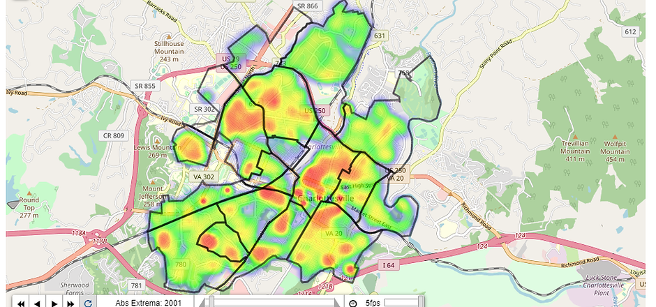
Figure 11. Total value across the City of Charlottesville from 2000 to 2019.
Source: GitHub Link
To compare a parcel’s sale amount and total value, the “overpriced index” was created. It is defined as the difference between a parcel’s sale amount and its total value in a year. Parcels with a positive overpriced index would mean a sale occurred in which the price was larger than the total assessed value while a negative index would mean a sale occurred in which the price was smaller than the total assessed value. Of the parcels with a sale and an assessment in the same year, around 70% of them had an overpriced sale (index greater than zero).
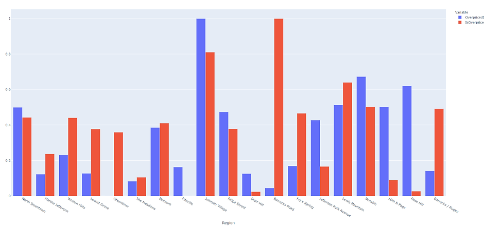
Figure 12. Overpriced index and proportion of overpriced parcels across regions from 2000 to 2019.
Source: GitHub Link
Figure 12 shows two variables that have been relatively scaled using a MinMax Scaler. This normalizes both variables into a scale from 0 to 1, so the smallest would be 0 and the largest would be 1. The purple variable is the quantitative overpriced index that shows how positive or negative the index has been for each region in the past 20 years. The red variable is the proportion of parcels in a region with positive overpriced indices over the total parcels in a region. Johnson Village stands out as the region with both of its variables quite high amongst the others. Interesting observations can be made about regions high in one variable but low in the other. For example, Barracks Road has the highest proportion of parcels that are overpriced, but one of the lowest overpriced index areas. This suggests that there were many sales that were pricier than the total value by a very small difference. On the other hand, regions like Rose Hill have relatively higher overpriced indexes but relatively small proportions of overpriced parcels. This suggests that the region has a few sales with large overpriced indices, and that the rest of the region has very few overpriced sales.
Two specific neighborhoods in the southern half are further looked at: Johnson Village mentioned above and Ridge Street which has the highest percent change in total assessment value based on Figure 16. For Johnson Village, the local extrema layer shows higher total value around properties clustered around Shamrock Road before 2007. From then on, the relatively higher value properties cluster around Bing Lane and the southeast portion of Highland avenue. From Ridge Street’s local extrema layer, properties along Harris Road to be most valuable before 2004. Afterwards, properties in West View Terrace and along Elliot Avenue had by far the highest total assessment values.
Figure 13. Johnson Village heat map of total value.
Source: GitHub Link
Figure 14. Ridge Street heat map of total value.
Source: GitHub Link
Figure 15. Average Percent Change in Total Assessment Value by Neighborhood Tax Years 2000-2020
Source: GitHub Link
Interactive Figure Link
Figure 15 shows the average percent change in total assessment value for each neighborhood over the past 20 tax years. Each data point was determined by calculating the percent change in a real estate’s total assessment value over the past tax year for each listed real estate property and then averaging the values found for a given neighborhood in that same tax year.
Figure 16. Average Percent Change in Total Assessment Value by Neighborhood 2000-2020
Source: GitHub Link
Interactive Figure Link
Figure 17. Average Percent Change in Total Assessment Value by Neighborhood 2015-2020. Source: GitHub Link
Interactive Figure Link
Figures 16 and 17 illustrate the average percent change in annual total assessment values of Charlottesville residential real estate in each neighborhood. The bar chart above shows the average percent change over the past 20 years, while the chart below shows the change over the past 5 tax years. The charts show that Ridge Street has been experiencing the greatest rate of increase in assessment values both in the past 5 and past 20 years.
Conclusion
From the survey’s results, it is clear that properties in Charlottesville have risen a lot, with the median sale amount tripling over the past 20 years. In recent years, the southern neighborhoods have had a relatively greater concentration of high priced sales compared to the rest of the city. When viewing based off of neighborhood planning areas, North Downtown, Barracks/Rugby, Venable, and Lewis Mountain have had the greatest median sales (although the last region has a low sample size). When further separated by year, Starr Hill emerged as a region with average median sale price in 2000 to the highest among all neighborhoods in 2020.
When viewing an alternative metric, total assessment, the general trend is shared with that of sale price: a shift towards higher assessed properties in the southern half. Interesting observations can be derived when using an “overpriced index” to quantify disparities between a parcel’s sale amount and total value in a given year. Johnson Village stood out as the neighborhood with a relatively high aggregate overpriced index and relatively high proportion of parcels that were overpriced.
Rory Stolzenberg, a member of the Charlottesville City Planning Commission, mentioned a couple of reasons for real estate price increases in Charlottesville. The amount of beds available in Charlottesville has not increased to accommodate UVA’s steadily increasing enrollment. He also added that part of the reason for large increases in real estate price between consecutive sales was an abundance of home flippers in Charlottesville. This fact should be taken into account when looking at Figure 8. The presence of house flippers makes it difficult to use housing sale data to evaluate affordable housing in the area. Additionally, the Charlottesville zoning regulations prohibit the building of attached homes (i.e. townhouses and row houses). This limits the amount of additional housing that can be created in Charlottesville.
Rory himself had found Fry’s Spring to be the neighborhood with the largest increase in real estate prices. There, vacant land and multi-family homes are being filled with single-family homes which further cuts the supply of available housing and increases prices for those wanting to live in that neighborhood. The issue of housing affordability is a complex problem, and the talk with Rory offered insights into possible extensions and improvements to this project. Findings from this analysis can hopefully be used in future policy talks that seek to improve the housing search for Charlottesville residents.